:: photo discussion ::
"The Exclamation Mark" by Gilad Benari
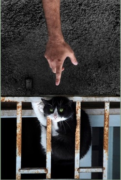
This could have been just another shot of someone pointing at a cat acting silly. But by turning the photograph upside down, the photographer immediately gets our attention. Although our brains know it's not unusual for a cat to turn itself upside down, the positioning of the bars looks "wrong" and therefore engages the viewer's interest.
The cat also looks slightly uncomfortable, which makes us wonder: What's going on here? Is the cat being affectionate, or is it stuck? Is the owner of that hand making fun of it, or calling it to the attention of someone who can help?
There is some tension in the stance of the cat; its position suggests it's trying to extricate itself. At the same time, it appears to be defying gravity by being positioned under the top part of the rail (which is really the bottom), which also gives the viewer's brain something to try and reconcile. If the cat is upside down, why doesn't it just slide down and out of the frame?
I noticed this flip-flopping and mirroring of images in several of the photographer's photos where the boundaries between what we think of as "up" and "down" aren't clearly defined, and therefore create intrigue.
This photo is an example of where breaking the "rule of thirds" works. The composition is split nearly horizontally in the middle of the frame, and then vertically by both the cat/bars and the arm - but the reason I think this works is because each element is balanced in its own section: the arm is centered and its color contrasts nicely with the dark texture of the stucco behind it. The paint and rust on the bars and the green of the cat's eyes pop against the darker wall and fur.
The line of the arm breaks the top of the frame and descends into a hand with a pointing finger that draws the viewer's eye into the cat - the focus of the shot (placed in the lower third of the photo) - whose somewhat circular shape is in contrast to that vertical line. For that reason, I feel this photo is aptly named; the composition, as well as the combination of straight lines with the curved lines of the cat, seems to say, "Hey! Look at this!"
The orange rust and additional smudge of pale blue on the wall also adds a little more color to an otherwise dull palette.
I'd like to know the story behind this photo.
:: best shot ::
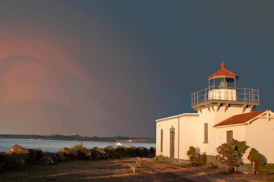
Here is the photo after further editing in Photoshop. I added some streaks to the sky with the fan brush, applied a Gaussian blur to soften the strokes, then merged the layers and applied the Paint Daubs filter to give it more of a painted feel.
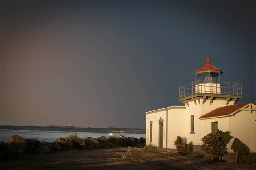
Feels Like Home
In search of my best shot, I headed to one of my favorite places hoping to find inspiration: Point No Point, near Hansville, Washington. I took about 200 shots during the golden hour and then culled them down to my favorite dozen, then to a handful, then two.
After going back and forth between this and another shot, I decided on the one posted here.
Why? Because I really loved the color of the light as it fell across the lawn and up to the lighthouse. I think the empty bench invites one to come and watch the sunset and listen to the waves.
Using the rule of thirds composition guidelines, I put the building in the right third of the frame; the contrast of the dark lawn and the diagonal of the rocks leading up to it is a natural progression for the viewer’s eye. However, the soothing horizontal lines of the horizon and water/mountains are located in the lower third of the frame.
A wide angle (24mm) was used in order to capture the entire lawn, rocks, water, and mountains in the background. The aperture was set at f/4.0 but since it’s such a wide shot there is really isn’t any bokeh (which I regret since it's beautiful). Since there was enough light for a fast shutter speed, the shot was taken without a tripod.
As luck would have it, the skies near the sun had some fantastic cloud formations, but the section behind the building was perfectly clear and boring - even though we Washingtonians have been longing for clear weather, it wasn't working for this composition.
So, I decided to artificially color the sky with something offering a little more drama and contrast. Since the building was so bright, it needed to be set against a dark, moody color - like lighting similar to the sunbreak following a summer storm. In spite of all the rain we receive here in the Pacific Northwest, that sort of dark sky is more common in the Midwest (where I'm from). It reminded me of home - hence the title.
In Photoshop, I selected the sky with the magic wand, inversed the picture, and moved everything but the sky to its own layer.
I didn't have a neutral density gradient filter for my lens, so editing the sky layer I used a gradient of earthy tones ranging from yellow to dusky rose to grayish blue to suggest both fading twilight and storm clouds. It still looked a bit flat so I applied the sponge filter to give it a slight texture (it ended up looking slightly "drawn" in but I liked the effect so I kept it).
I did a little clean-up work around the rails of the turret since moving it to another layer produced some slight artifacts. The image was first saved as a .PSD (because I'll be making further edits), and then reduced to 72 dpi and saved as a .JPG for the web.
Finally, the photo was imported into Lightroom and the PC Vignette 1 filter was applied.
All told, I found it extremely difficult to go out with the intention of creating my “best” shot. Although I have limited experience when it comes to photography, as with other forms of art the evolution of the best pieces are often serendipitous. I’ll always feel my best photo hasn’t yet been taken – but once it is, it will hopefully always be upstaged by an even better one.
Elements:
ISO 250
f/4.0
24 mm
1/2000 sec.
· Lighthouse breaks the frame and is the subject of the shot
· Photo was taken during the golden hour
· Non-distracting background
· Complimentary color contrast (white of building vs. gray sky, red of turret vs. blue sky)
· Diagonal and horizontal lines
· Frame dynamics: eye moves naturally from left to right
